The MasterClass Series #21
Capturing Architecture without Distortion Part-2
Equipment
Leica V-Lux Typ114.
EXIF #1
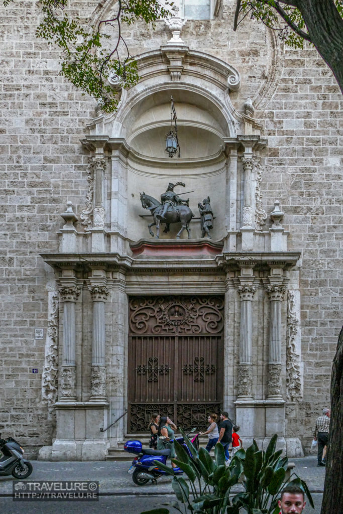
Church of St Martin and San Antonio Entrance, Valencia, Spain
Focal length: 30mm
Aperture: f/8
Shutter speed: 1/500
ISO: 2000
EXIF #2
Santa Catalina Church, Valencia, Spain
Focal length: 25mm
Aperture: f/7.5
Shutter speed: 1/60
ISO: 3200
EXIF #3
Another view of Santa Catalina Church, Valencia, Spain
Focal length: 25mm
Aperture: f/9.5
Shutter speed: 1/60
ISO: 3200
Editing
Adobe Lightroom Classic CC
From a hardware solution for capturing architecture without distortion, let’s now move over to a software solution.
The Story
The second solution to address distortion in architectural photographs is software-driven. If you use Adobe Lightroom CC, we can address this distortion using the ‘Transform’ panel in its ‘Develop’ module. But before getting there, let us understand the two distortions.
The Challenge of Capturing Architecture without Distortion Part-2
If you tilt the camera up or down, a vertical distortion occurs. And, if you tilt the camera to the left or right, the shot will have a horizontal distortion. HERE is another shot that was corrected by using Adobe Lightroom CC. Let us see how we can address this challenge.
The Shots
Let me elaborate on this concept by sharing a double-distortion shot. The Church of St Martin and San Antonio entrance in Valencia, Spain does not offer a decent vantage for a one-point perspective shot. It forced me to shoot by tilting the camera left and up. As a result, the shot had both – vertical and horizontal distortion.
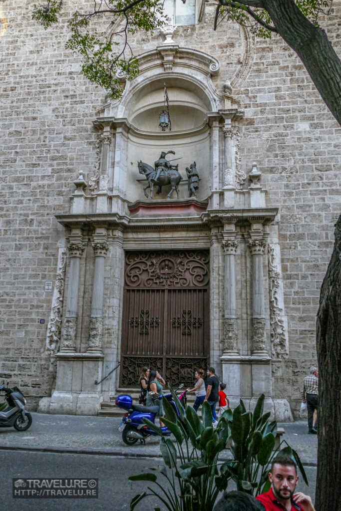
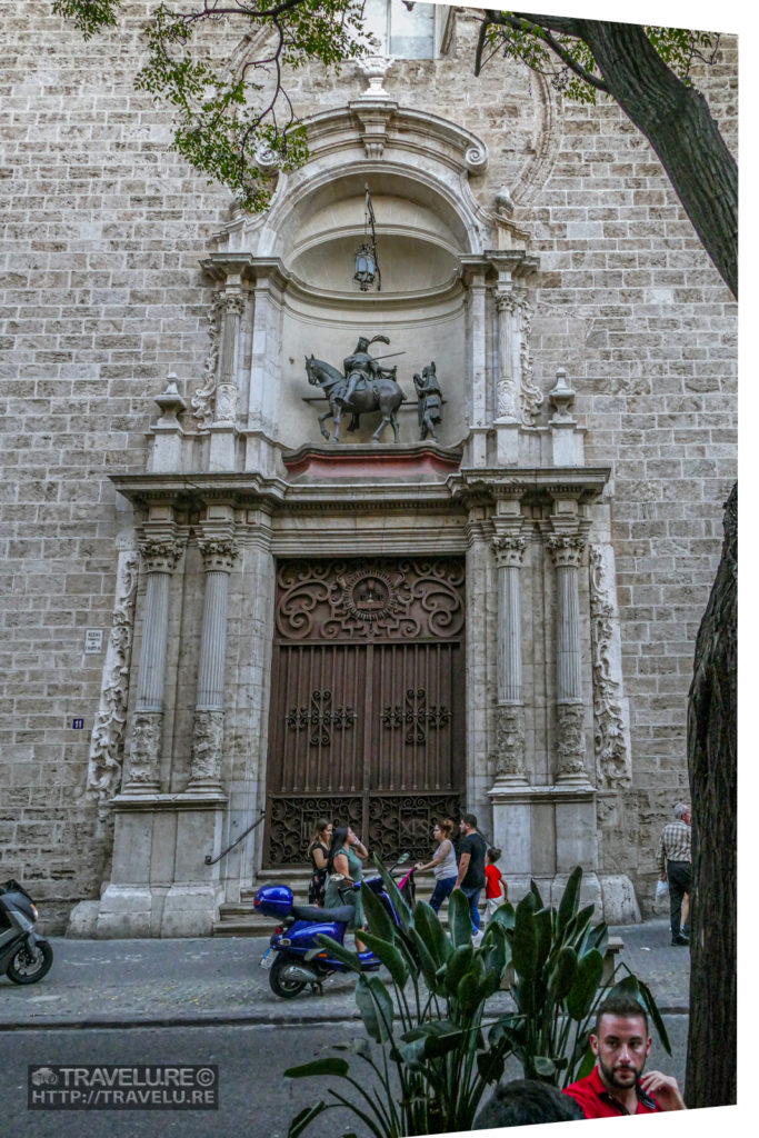
Using the ‘Transform’ panel in the ‘Develop’ module, I started by fixing the horizontal perspective. For that, I moved the ‘Horizontal’ slider to -20 (for any shot where you tilt the camera to the right, move the slider to the plus side).
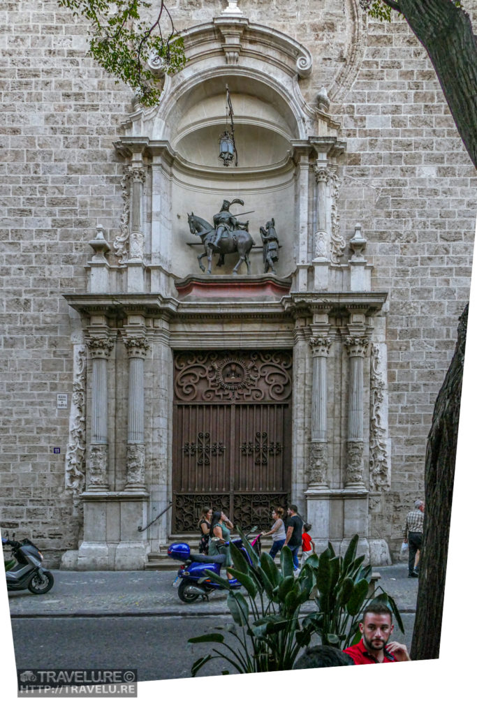
My second step was to address the vertical distortion by moving the ‘Vertical’ slider to -30 (a plus change would have been necessary if I had tilted the camera down).
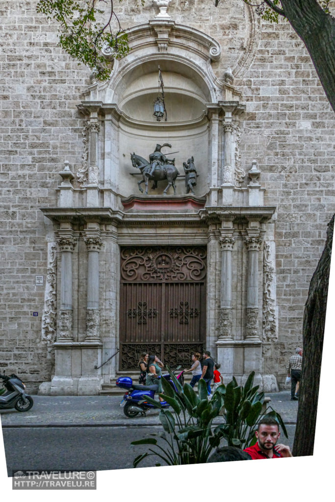
These adjustments elongate the building entrance. For fixing that, I moved the ‘Aspect’ slider to a little over two-thirds of the ‘Nett Cumulative Change’ (NCC) in vertical and horizontal sliders (NCC on both sliders was -30 + -20 = -50, and I shifted the ‘Aspect’ slider to -35).
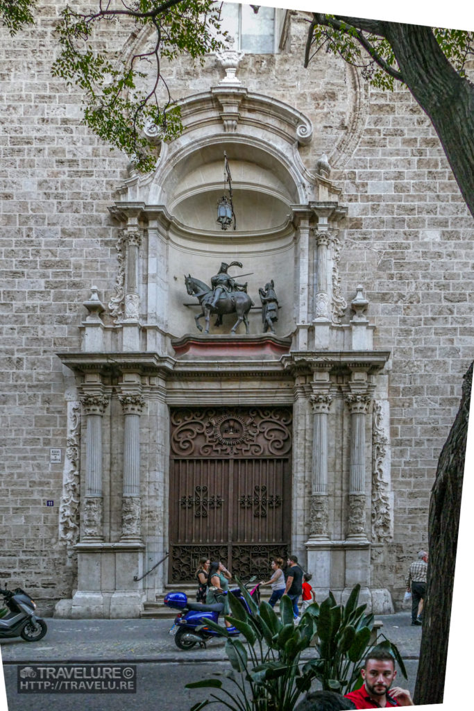
By doing that, the image had moved towards the top, leaving the bottom as blank white space (see image 5). To adjust that, I shifted the entire image down by moving the Y-axis slider to -10.1.
I wrapped up the process by checking the ‘Constrain Crop’ checkbox. That gave me a final corrected image (see Image 1).
Shots #2, and #3
The settings were:
In shot #2,
Vertical Slider: -54
Aspect Slider: -38
Constrain Crop Checkbox: Checked
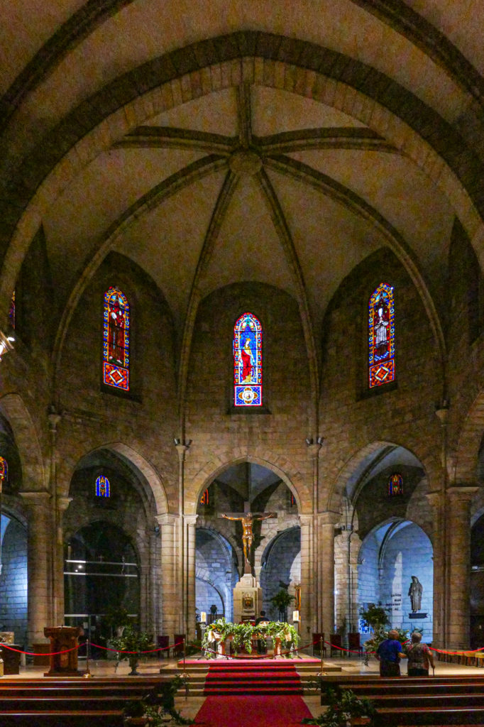
In shot #3,
Vertical Slider: -51
Aspect Slider: -38
Constrain Crop Checkbox: Checked


