Solomon R. Guggenheim Museum, NYC – Maverick Architecture
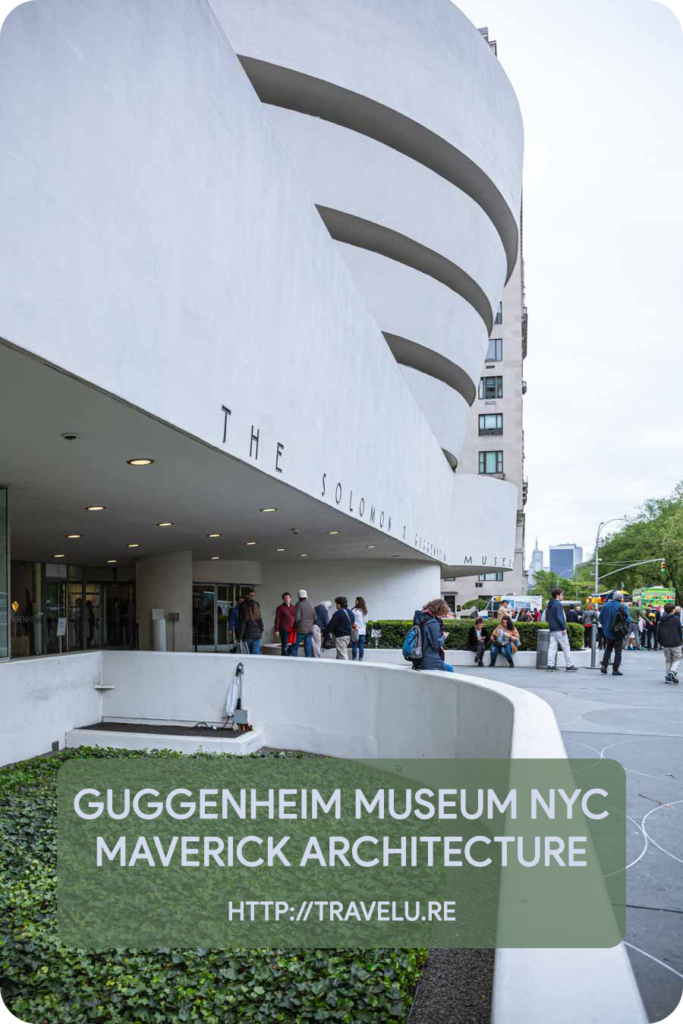
My walk along the NYC museum mile, as I cut across part of it through the Central Park, led me to Solomon R. Guggenheim Museum. The first impression of this pristine, unusual structure? A lop-sided, heavier-on-the-right light-grey fondant cake with a lavish expansive base tier, topped with expanding concentric circular tiers.
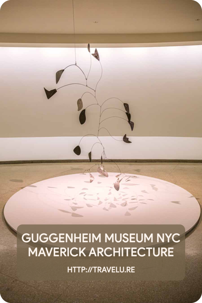
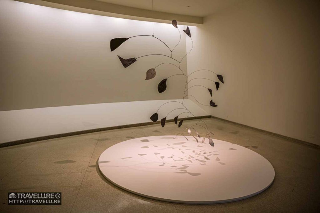
What UNESCO has inscribed today on its World Heritage Sites’ list faced bitter criticism when it opened its doors to the public in 1959. ‘The architecture dominates the paintings,’ was the sole pretext of its criticism. And it is true. I spent most part of the afternoon at the museum and did not notice the exhibits. The remarkable structure that defied architectural conventions wowed me.
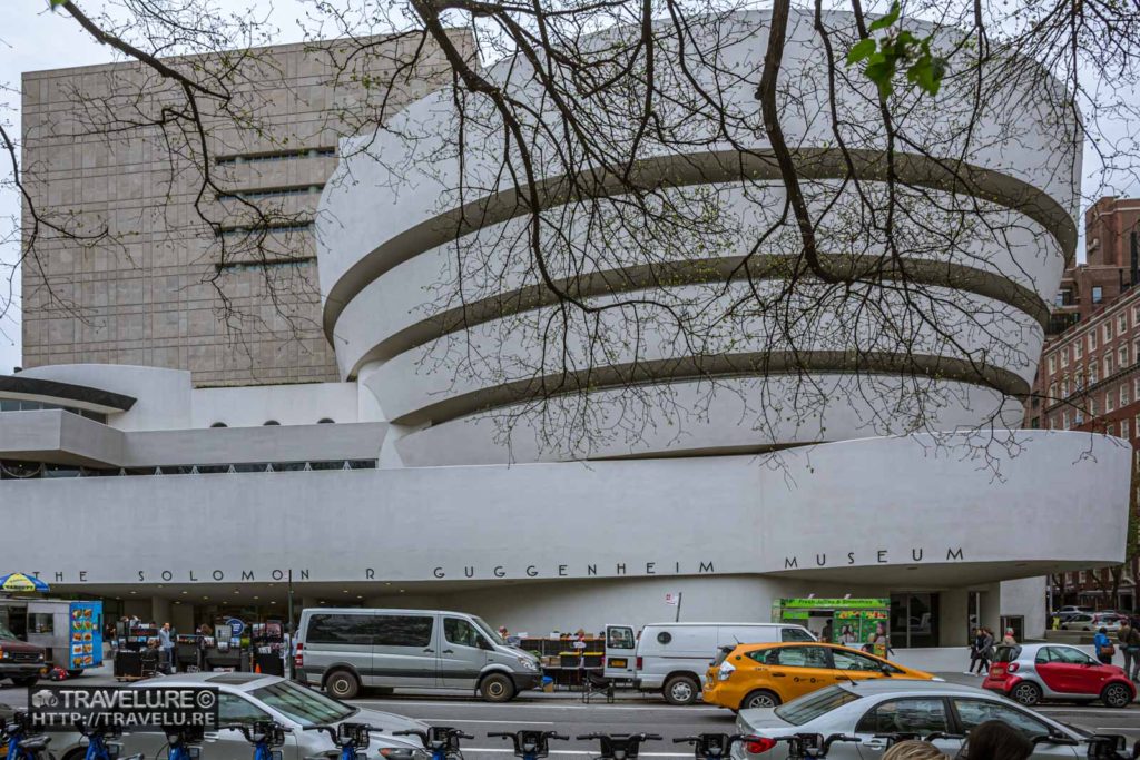
Guggenheim Museum Architecture
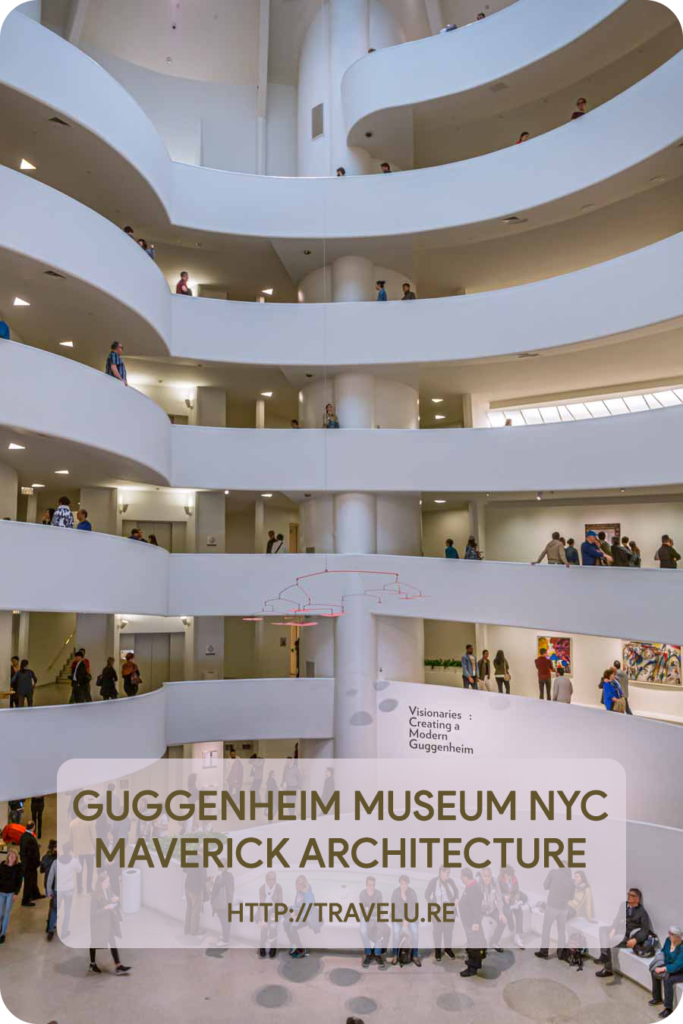
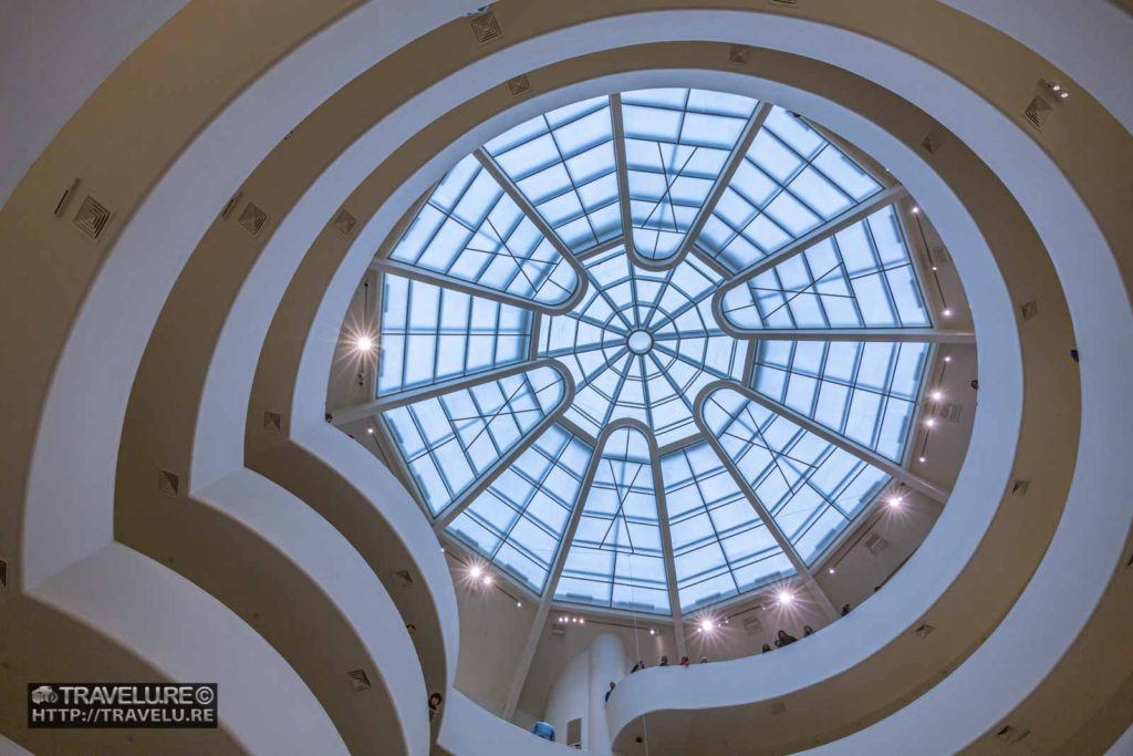
Frank Lloyd Wright, the architect of the museum, obsessed over nature, and organic form. It is clear in his collective body of work UNESCO has inscribed on its World Heritage List. His body of work is spread over cities, prairies, and deserts. While the Guggenheim Museum is not its most representative example, the overarching vision is that. Sunlight floods the interiors from a large skylight perched on top, and the circular shapes in nature have inspired its spiral rotunda.
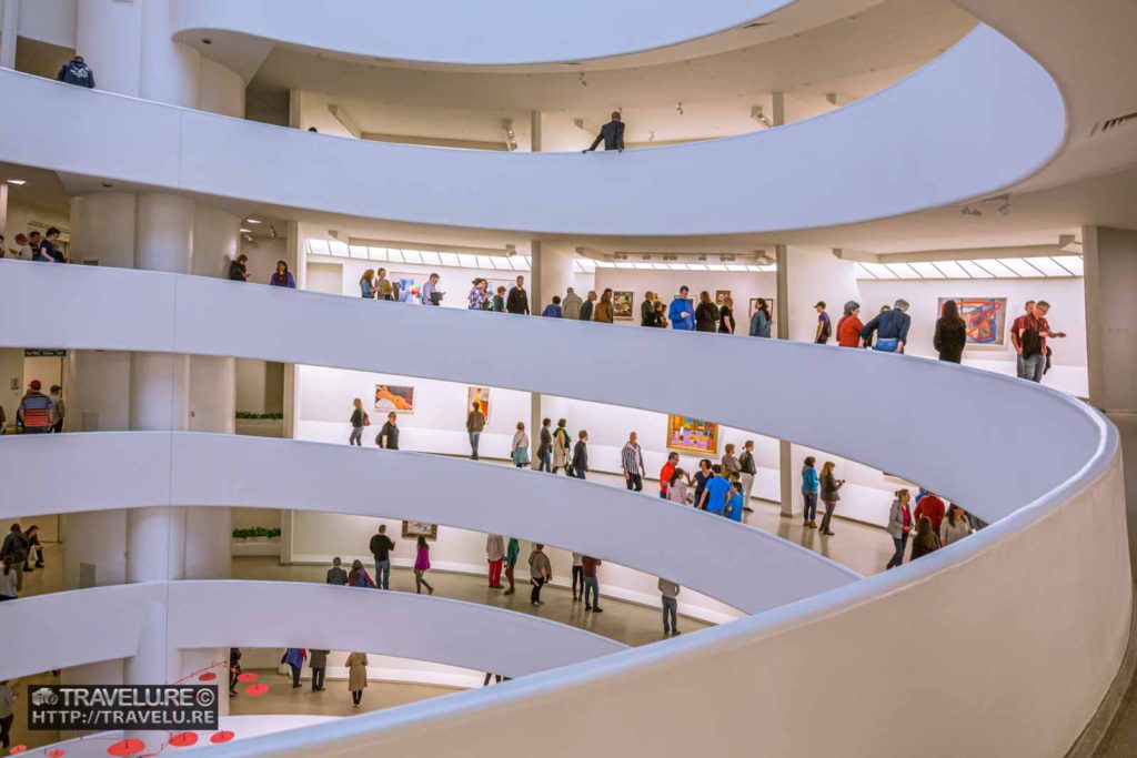
From the inside, floors don’t bind the rotunda. It is a continuous ascending spiral that rises at an incline of 18 degrees and is 1416 feet (a little over quarter of a mile) in length. The wall of the spiral slants outwards at a 97-degree angle, and windows line the entire length of this climb to let in the light!
Architectural authorities debate. Some say the shape of the edifice is like a nautilus shell, while others vacillate between a not-so-nature-driven concrete ribbon and an inverted ziggurat (a pyramidal, and stepped Babylonian temple). Call it what you will, the ultimate design that came out after over 200 sketches stands out like a convention-breaker in Manhattan. Little wonder overcoming the NYC building code restrictions took longer than its design or construction.
Lesser-known stories
Architect Wright envisaged the gallery as different from others. Normal galleries forced people to go past long corridors to see the exhibits and then retrace their path to exit. In the Guggenheim Museum, if you take the elevator to the top, you can stroll down the spiral as you take in the exhibits, and exit from the lowermost level.
His belief extended to the inclined wall as the incline provides a better viewing perspective and light to the exhibits compared to if you hang them in a vertical position. Wright wanted a Cherokee Red exterior. But that was not to be.
In 2008, when the authorities designated the building a national treasure, they had to invoke a special exception as the building was just 48 years old, as against the mandatory 50-year requirement of this designation.
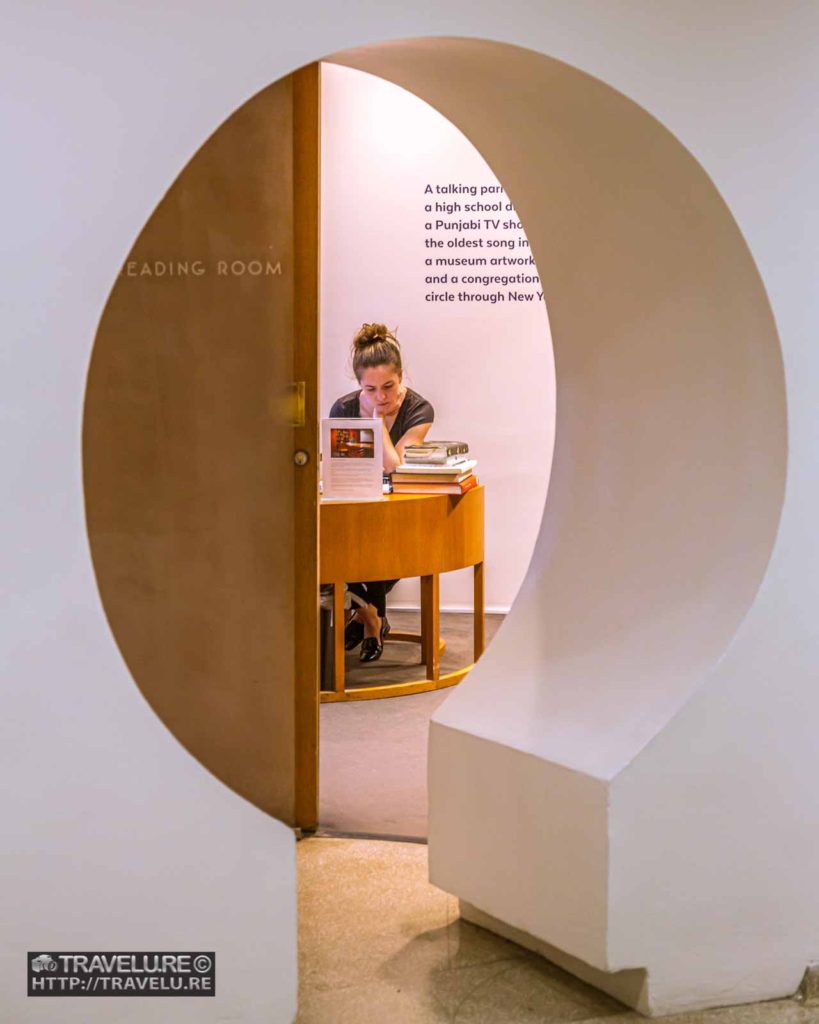
To paint the interior, they may need to shut the gallery for a week or more. So, the white paint on the interiors is refreshed every day as it gets scuffed up with an inflow of visitors. This patchwork of refreshed paint adds to the character of the interiors.
While one may go on and on about this path-breaking structure, here, the form follows the function. So, even if you are not the museum-types, a visit here will leave you mesmerised!

